Beep, beep, beep…

Bernhard Obenhuber
Apr 24, 2024

Our blog post on March 27th 2024 explored the macro-fundamentals that should ideally be in place for a country to go down the challenging path of obtaining a maiden sovereign credit rating (Link). Typically, a sovereign rating is a stepping stone for governments to tap the international capital markets. Conversely for large institutional investors, a credit rating issued by one of the big three rating agencies is often a prerequisite for investment consideration.
However, a diligent portfolio manager will not – and seriously should not – take the rating at face value but will carry out her own, or primary, research. A comprehensive analysis will include consideration of other secondary research (e.g., Article IV report by the IMF), and go to primary sources, like the country’s ministry of finance, debt management office or statistical agency. With “going”, we don’t mean physically visiting the country – although it is advisable from time to time – but we mean visiting the various webpages online.
So in this blog post, we want to share some information on how accessible the various government agencies is from a technical point of view. Why does this matter? Because as many diligent analysts would concur, visiting a website that doesn’t take ages to load makes the analysis process agreeable and efficient. The analytical process starts with a basic understanding of statistics and policies. Again, in our experience when an investment case has to be made, we need to be able to access, verify and crunch data fast. Access to information – and the speed in which one can do this – is essential. We’ll cover the quality of content in a future blog post.
What we did
We looked at 300 webpages across 174 countries, covering webpages of each country’s ministry of finance and central bank. We started with a larger number of webpages, but some were either down or the access resulted in a time out. We used Google’s PageSpeed Insights API (Link) to analyse the webpages. For the unfamiliar, the API is a tool commonly used by web developers as it gives a detailed assessment of the web pages’ quality. If you’re interested, the many metrics are explained here in detail (Link).
We picked a small set of indicators that focus on the speed and amount of data that is transferred:
- Speedindex: Speed Index shows how quickly the contents of a page are visibly populated (Link).
- First Contentful Paint: First Contentful Paint marks the time at which the first text or image is painted (Link).
- Total Byte Weight: Large network payloads cost users real money and are highly correlated with long load times (Link).
- Total Requests: Number of page requests made.
- Total Tasks Time: Total duration in ms to load the page.
What we found out
Before we share the results, we need to mention some caveats: Firstly, the results are based on one point in time. We accessed each webpage only once during the afternoon of Tuesday 24th April (CET). For a more accurate picture, one should average the mentioned metrics over a longer period (e.g., access the pages on an hourly basis for 10 days) to reduce the risk of unfortunate timing. Secondly, one might also repeat the exercise from different locations and average the results.
Patience is a virtue
With that out of the way, let’s look at some charts. The first chart shows the histogram of relative frequencies of the time it takes to load the pages.
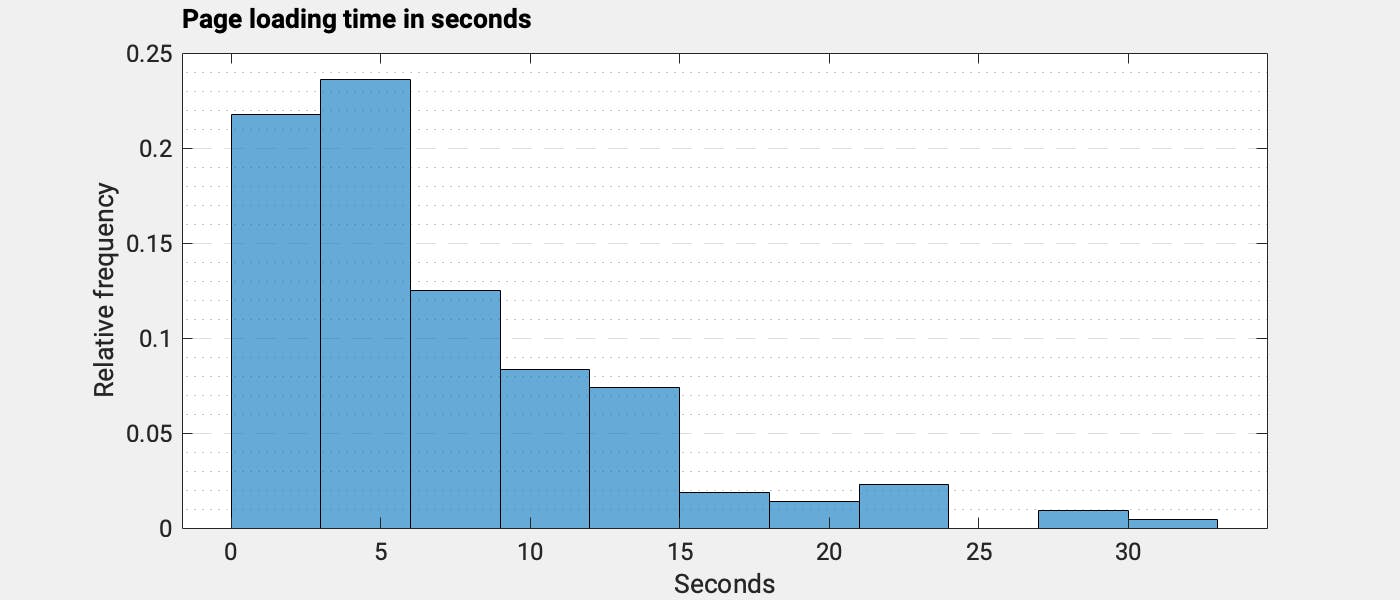
Most pages loaded quite quickly; it took just a couple of seconds to access information. Typically, a loading time of two seconds is considered good. My personal patience gets tested when a page takes more than 10 seconds. That’s just like watching paint dry. If you have the slightest attention deficit, 10 seconds seems a lifetime.
And as you can see in the chart below, there are several pages that took longer than 20 seconds to load. If you only need to access a single page from time to time, then this might be acceptable. But if you need to search for information, such loading times are very frustrating as they quickly add up. It’s easy to lose it…
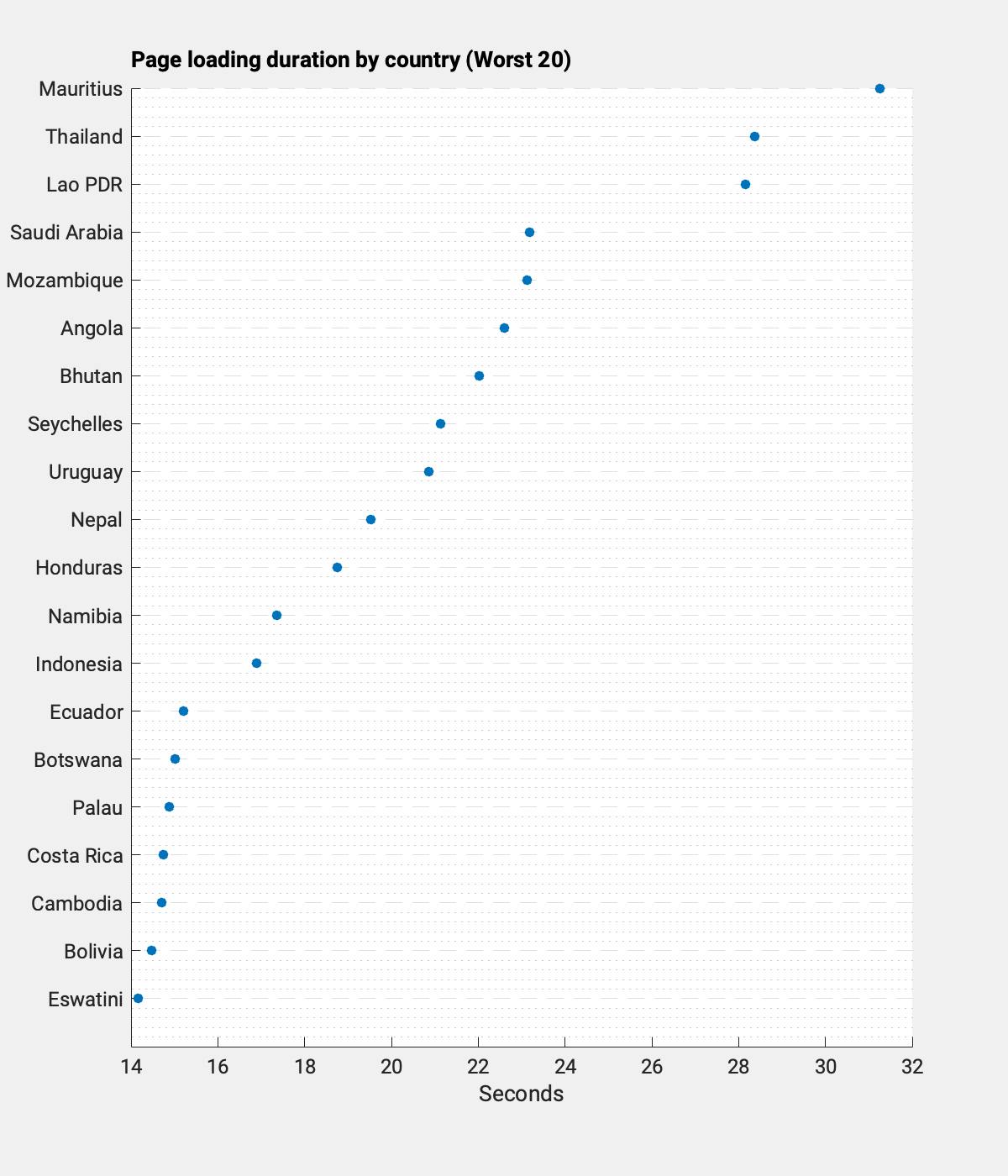
Let’s take a look at which webpages take their time. Mauritius, Thailand, and Laos took by far the longest to load. In the case of Mauritius, we accessed the page of Bank of Mauritius (Link).
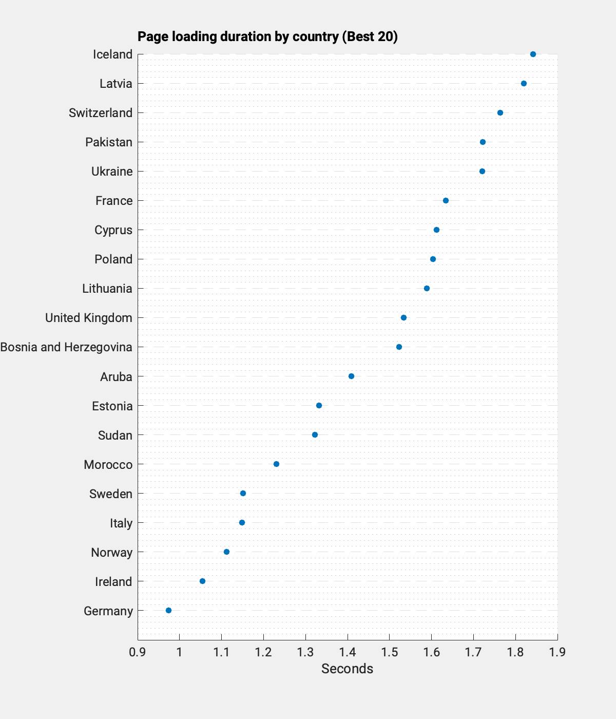
On the other end, Germany, Ireland and Norway loaded at what seemed to be the speed of sound, at least in a developer’s point of view. It took just one second. The unexpected one here is clearly Sudan (Link). It might not be the prettiest page – but that is in the eye of the beholder – but it loaded quite fast. I’ll take speed over pretty.
The key factor that determines page load time is the amount of data that needs to be transferred. A page with many photos, videos or other animations takes much longer. Of course, the distance between the requesting computer and the server hosting the webpage is also relevant, but by far less than the amount of data. The chart below shows the worst performing country based on the “Total Byte Weight” metric. One example is the Algerian ministry of finance. Accessing their page used more than 200 MB of data. The chart shows a lower amount as the National Statistics (Link) page lowers the average significantly, and The Bank of Algeria could not even be analysed as it often ran into timeouts. 200 MB is really a lot, lot… Fortunately, most of us have an internet flat rate.
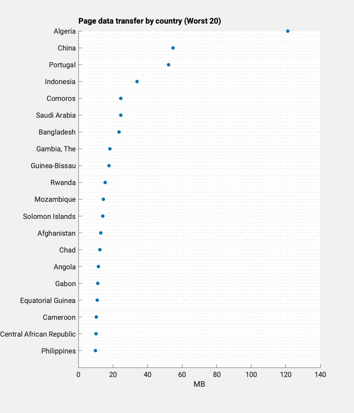
The Google PageSpeed API also gives details about the individual elements that are loaded and how much data traffic is needed. For example, in the case of the Algerian ministry of finance, the web page administrators thought it was a good idea to put multiple photos each having a file size above 10 MB on the page (e.g. Link). Personally, I don’t think such a snap will help attract foreign investors. Again, speed over looks. From the pure tech side, it would take the web developer just 15 minutes to swap the existing images with ones with lower resolution to get the page load much quicker. It’s a fix that would make analysts happier and less bored and is conducive to helping the environment.
Environmental impact
Besides the frustration it creates when one is looking for information and it takes ages, webpages with unnecessary data traffic also have a wasteful environmental impact. Storing and transferring data requires substantial energy. According to data by the IEA, data centres and data transmission network are responsible for around 330 MtCO2 equivalent (2020) or 0.6% of global GHG emissions (Link). The research process and the environment benefits from leaner webpages.
Content matters
So what does this all mean? Coming from a practitioner’s viewpoint, what matters to me is content and the ability to make my own judgment about a country’s sovereign risk rapidly. This essentially means that I need to be able to verify data from first-hand sources, i.e., the government, its central bank, and statistical offices at an acceptable speed to make an investment case. Because although I can tap secondary sources or data providers, they are not without error.
In an upcoming blog, we will actually look at the content of the various government pages and check if information that is relevant for country and sovereign risk assessments can be found.