ESG: Income bias or the case for doing the homework yourself

Bernhard Obenhuber
Jun 08, 2022
In recent years, asset owners—including pension funds and individuals—have increasingly demanded that asset managers explicitly consider ESG factors when making investment decisions. Now, this trend is taking hold amongst owners of government bonds. A development which, given that such bonds constitute the largest asset class, is long overdue.
Consequently, we’ve seen a flurry of sovereign ESG risk ratings and scores from data providers, along with growing scrutiny and criticism of such assessments. For example, the World Bank publication ‘Demystifying Sovereign ESG’ states:
“We find that about 90 percent of a country’s sovereign ESG score is explained by the country’s level of development and that a country’s national income permeates all sustainability-linked measures used by the market.”
The authors also recommended that we should account for this “ingrained income bias” when assessing sovereign ESG risk.
Assuming that the objective is to build a composite measure of ESG, we share this view. To achieve this, it can be helpful to look at ESG indicators in the context of the country’s overall level of development or economic wealth. However, as is often the case, the implementation is not entirely straightforward, and care must be taken to avoid unintended consequences.
Correcting for the ingrained income bias
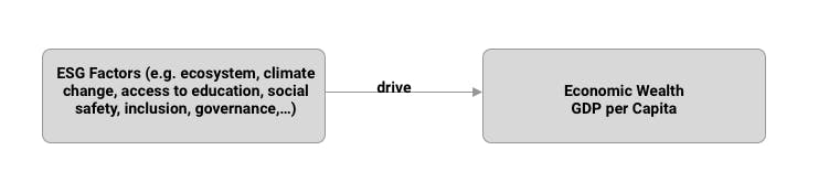
Let’s look at an example: quality of education, as measured by (net) secondary school enrolment ratio. It’s a safe hypothesis that wealthier countries will have a better quality of education. Because such countries tend to have more of the resources needed to provide secondary schools for its citizens, and wealthier people are much more likely to have the means to send their children to those schools. Meanwhile, in a poor country with a lower GDP per capita, parents are more likely to have to send their children to work instead of school. This is a prime example of ingrained income bias.
Based on World Bank data, the top and bottom five countries in terms of secondary school enrolment ratios are:
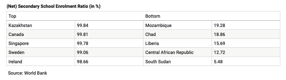
Finding Kazakhstan at the top of the list is a bit of a surprise. Even so, this confirms the overall hypothesis: richer countries have a better quality of education, as measured by secondary school enrolment.
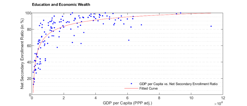
So, let’s control for this ingrained income bias. First, we plot countries’ income versus their enrolment ratio. We’ve done this in the chart below, which also shows the relationship predicted by our hypothesis.
This raises a number of questions.
The first is: what is the right measure of income? We used GDP per capita with purchasing power parity (PPP) adjustments. Here, the GDP figure is adjusted for the different prevailing price levels across countries. However, you could also use different measures of economic wealth per capita such as GDP per capita based on some international exchange rates, or maybe gross national product (GNP) per capita.
Another question is: what is the right estimation method? Linear estimation? Probably not. The fitted curve in the chart above seems to be a decent match, as it is constrained by 0 and 100 (without reaching those extremes) no matter the level of wealth. The choice of estimation method will have an impact on the resulting conclusions and is likely dependent on the type of indicator that should be corrected for the income bias.
And finally, we might ask: which data should we include? For some countries, the latest enrolment ratio data available is over five years old.
Putting these questions aside, we can calculate the enrolment ratio implied by a country’s level of wealth and plot it against the actual enrolment ratio. The results are shown in the chart below. Every country above the 45-degree line has higher enrolment ratios than its level of wealth would suggest. For instance, Afghanistan has an enrolment ratio of 50%, even though its relatively low GDP per capita would suggest a ratio of just 37%. The opposite holds for all countries below the 45-degree line. All of this raises another question: how good is the underlying data?
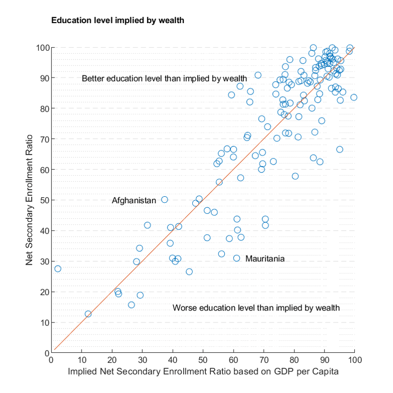
The World Bank suggests that we should “reward” countries that do more with less. With that in mind, the top 15 out-performers are:
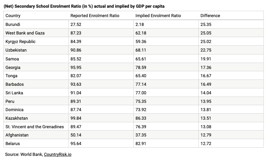
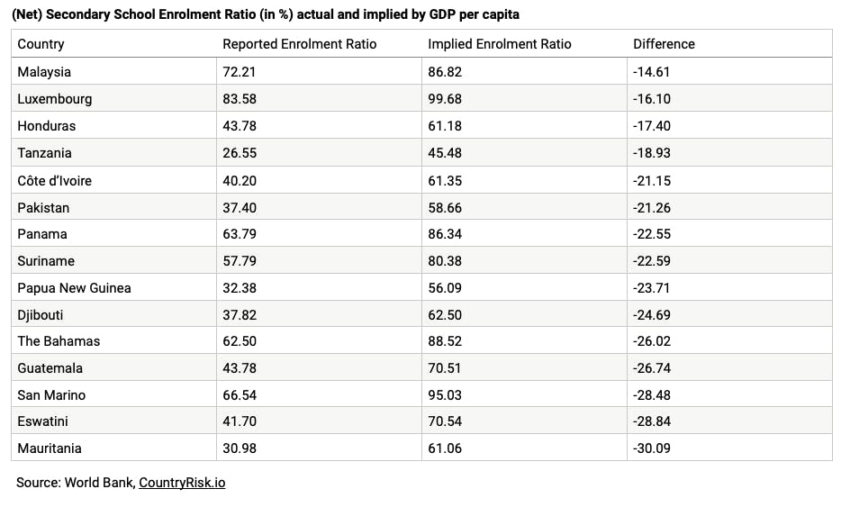
And the bottom 15 under-performers are:
In sum, controlling for wealth provides some insights into relative performance and country rankings. This analysis can be improved even further by tracking the momentum over time.
Peer groups make for better comparisons
As we’ve seen, one might ask whether GDP per capita is the most appropriate controlling variable. As sovereign analysts, we spend a lot of time thinking about how to choose the most comparable peer countries. We’ve learned that these are some of the factors that should be considered:
- Overall level of development: Comparing Sweden with Benin isn’t very instructive. While GDP per capita is a useful proxy when narrowing down the countries for your peer group, you can also look at information about economic structure (i.e. share of agriculture, industry, and services) to ensure you’re comparing apples with apples.
- Economic integration: The risk characteristics of a small, open economy are different to those of a large, closed economy. Think Brazil versus Croatia.
- Importance of natural resources: It makes more sense to compare commodity exporters with each other than with commodity importers.
- Geography: A small island state is exposed to different risks than a land-locked country.
So, based on these considerations, we would define five to 10 similar peers for each country. You could do this through expert judgement—the preferred option—or by completing a cluster analysis that takes measures of these considerations as inputs. Defining a comparable peer group enables you to ranking countries appropriately. And it allows you to conduct a proper assessment of their relative momentums (improvement versus deterioration) in terms of, for instance, which country’s enrolment ratio is faring best.
The case for ESG integration
At CountryRisk.io, we provide an integrated ESG Sovereign Risk Score that considers many indicators. For us, “integrated” means that, together, the selected ESG indicators capture countries’ sovereign credit and default risk, but that they shouldn’t be considered in isolation. We find that, in a model calibrated for sovereign credit risk, the differentiation between ESG- and non-ESG indicators is misplaced and arbitrary.
If you’re only interested in the headline country risk score (0–100) or rating (AAA–C), the additional ESG indicators have historically been of limited value when measuring the probability of sovereign defaults. This is because, as concluded by the World Bank, GDP per capita is a good enough proxy for overall development. Also, investors and policymakers have paid little attention to the strength of ecosystems, climate change, and social aspects in the past.
So, why do we think there’s a case for including ESG indicators in a sovereign risk model? The first part of the answer is that history is replete with examples of failed states and countries experiencing a gradual decline in wealth. So, if your task is to identify the next country success story—or, at least, to avoid the next failed state—it’s a bad idea to consider only the level of economic wealth (i.e. GDP per capita).
The second part of the answer is that the value of an ESG rating lies not in the rating itself, but in the understanding of a country’s risks and opportunities it provides. You should invest in a country not because it has a AAA rating, but because it has well-functioning institutions and a strong education & social system. The country should also have a track record of policymaking that promotes the increase of financial, environmental, and social wealth by developing its human capital through, for instance, the delivery of quality education.
Similarly, a country that’s already prepared itself to deal with physical risks (e.g. through flood protection and innovative risk sharing mechanisms) and transition risks (e.g. through incentives for households to switch from oil to solar heating) is well positioned to improve its citizens’ welfare.
In short: ESG sovereign risk analysis is the search for fundamental drivers of growth and credit risk. Broader economic and ESG indicators, along with a familiarity with the country’s history, are necessary to identify its strengths and weaknesses, so we can understand the extent to which that country is equipped to deal with an uncertain future.
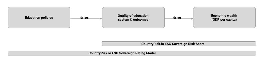
At CountryRisk.io, we distinguish between our ESG Sovereign Risk Scores and our ESG Sovereign Rating Model. The former is is a purely quantitative measure of sovereign credit risk, which makes it useful for monitoring many countries in a consistent way. Meanwhile, our ESG Sovereign Rating Model enables you to complete truly comprehensive sovereign risk assessments. It does this by incorporating a wide range of quantitative indicators alongside a set of qualitative indicators, such as education policy assessments, that allow you to arrive at a more nuanced view of the country. For instance, the education policy assessments show that Austria, Germany, and Switzerland compare relatively poorly in terms of (tertiary education) enrolment ratios because of their dual education systems. Such systems lead to underreporting and apparent underperformance in ESG scores.
Our mission is to equip organisations with the tools they need to conduct their ESG sovereign risk due diligence in-house instead of relying on external rating providers. And with ESG sovereign risk assessments fast becoming the de facto standard, this is becoming an increasingly significant differentiator.
If you’d like to learn more about our approach to assessing ESG sovereign risk, visit CountryRisk.io, where you can create a free account and begin using our open-source rating model. You can also book a training session on how to use our ESG rating model or on how we can adjust the rating model to meet your needs.