ESG risk — in the eye of the beholder
The explosion of interest in sustainable investment has led to an explosion in the supply of ESG corporate data.

Bernhard Obenhuber
Mar 23, 2021

The niche providers that have been quietly and laboriously collecting data over the last couple of decades have been joined (and often acquired) by the big beasts of the financial information world — Bloomberg, FTSE Russell, MSCI — as well as the credit rating giants Moody’s, Standard & Poor’s and Fitch.
In the sovereign space, data that is now labelled as ESG — for example environmental or educational metrics — has been collected for many decades. There have been data improvements and innovations, and the ‘official’ UN Sustainable Development Goal (SDG) indicators and targets provide more support and incentives to statistical offices around the world to fill the numerous data gaps.
Nevertheless, in CountryRisk.io’s experience, the ESG data that is considered for ESG risk scores and rankings by various ESG data providers is very similar. So, one wonders how diverse the actual ESG ratings can be if the underlying data is similar?
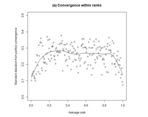
This question was also stoked by a recent paper “Climate Financial Risks: Assessing Convergence, Exploring Diversity” by Bingler, Senni and Monnin. The paper explores different climate risk metrics for corporates and finds that there is a wide range of assessment outcomes for a particular company across different data providers. However, the authors also find that there is convergence in terms of assessment across providers when it comes to the extremes; companies with very good or very bad risk scores.
To put it differently, ESG data providers agree which companies are very good and very bad in terms of climate risks. This finding is summarised in the chart below from the paper where convergence is measured as standard deviation across data providers for a specific company at the edges and disagreement in the middle section. Other research has similarly found a very wide variation of ESG scores across data providers.
The criticism that ESG ratings of the same issuer can vary widely between providers has become intense in recent months. This study found an average correlation of overall ESG ratings of only 0.46, and just 0.19 for governance ratings. Each provider uses its own methodology, leading to different views of the same issuer.
A similar story for sovereigns?
At CountryRisk.io we don’t put any weight on corporates and are no experts in ESG analysis of them. However, we thought that it would be of interest to see if we can replicate the findings of the study mentioned above for countries. Our hunch is that everyone agrees which countries rank high and which ones fall at the bottom. For example, in Robeco’s sustainability ranking, the top places are taken by Sweden, Finland, Norway, Denmark, Iceland and Switzerland. Similarly, the SDG Index by the UN SDSN ranks Sweden, Denmark, Finland, France, Germany, Norway at the top. Countries like Central African Republic or Chad are classified as the worst performers by both rankings.
We wanted to look into this into more detail. This is what we did.
- We first ‘simulated’ ESG country rating providers. Publicly available ESG country ratings and scores are very limited. However, most data providers — as far as we can tell — use the same underlying statistics and apply their own touch, such as which ESG indicators to consider and weight. So, we took the World Bank ESG and SDG database, which consists of around 400 indicators across various ESG themes. We selected the ones that are comparable across countries, scaled and normalised them between 0 and 1, where higher values indicate better ESG performance (e.g. lower CO2 emissions per capita or higher education levels).
This resulted in around 150 indicators with varying data availability across our universe of 190 countries. Finally, we generated 100 different ESG country rankings by randomly selecting 30 indicators out of the 150. This represents the variation in methodologies. - We then calculated the variation per country. Step 1 gave us 100 ESG scores for each country. Based on those, we calculated the average and variation of the ESG scores per country. The result is shown in the scatter plot below:
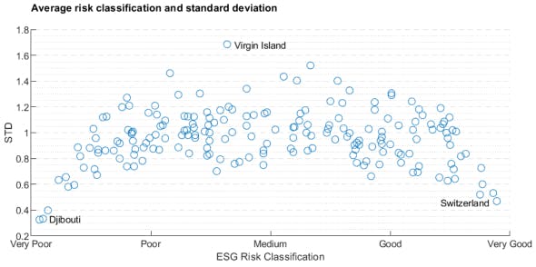
Drum roll: We get similar results as researchers found for corporates, with convergence at the tails and higher variation in the middle section. The simulated models agree that Switzerland has a strong ESG rating while Djibouti’s is very poor. The standard deviation is a multiple in the middle part.
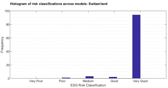
To illustrate this point, the figure below shows the distribution of model outcomes for Switzerland. Of the 100 models, 94 put Switzerland into the ‘Very Good’ risk category. One model classifies it as ‘Poor’, three as “Medium” and two as ‘Good’. There is pretty much model consensus on Switzerland.
Transparency and value of diverging views
So, what are the takeaways from this exercise? We would argue that:
- It does not matter too much which ESG indicators one considers; the usual suspects will come up on the top or at the bottom.
- The variation is substantially greater in the middle of the distribution. A country might be assigned as ‘Poor’ or ‘Good’ category depending on selected indicators and other model considerations.
- It is important to understand how the ESG score of a third-party provider is constructed. Don’t accept a black box.
- We would advocate constructing ESG scores in-house and building up the necessary capabilities.
“Overall, there is no strong evidence that green bond issuance is associated with any reduction in carbon intensities over time at the firm level.” the BIS said in an article in its recent BIS Quarterly Review.