CountryRisk.io: Global trends in sovereign risk

Bernhard Obenhuber
Aug 24, 2018

This article was originally published on 20 May 2018 on LinkedIn.
Argentina talks to the IMF for financial support; shortages in food and medicine continue to plague Venezuela; corruption in Brazil is worsening; populism and trade wars are starting to take some root.
This is certainly not an exhaustive list of what is going wrong nowadays in the world. Depending on where you live and your interests, many other dark clouds will come to your mind. As for a former credit analyst like me, focusing on the downside remains an occupational illness. Being aware that we are living in times of a news echo chamber where our existing beliefs and perceptions are amplified, I wanted to explore the questions Is there much more room for sovereign risks to increase? What are the traditional indicators saying?
Sure, I ran some numbers but before I get to the results, here’s a short disclaimer on our focus here: the emphasis is on sovereign credit risk, i.e., we look at governments’ ability to service their foreign currency debt obligations.
Yes, this note could have also aimed at questions like Is the world becoming a happier place? or More upside to equity markets? Equally interesting issues and definitely worth looking at… But for now I may be able to provide a different dimension to sovereign credit risk concerns based on previous work in the area that I’ve done, so I thought I would just throw this in — my first in a series. Work on related quantitative modelling can be found here.
Global view: strong fundamentals
The chart below summarizes a very broad range of economic and financial indicators for 192 countries, aggregates them by the countries’ relative size of nominal GDP and maps it into a letter-rating with which many of you will be familiar. AAA is the gold standard of low sovereign risk (think: Norway, Switzerland), and anything with a C is very, very risky. D means that it is already too late as the country has already stopped paying investors, and some of you may be part of a class action lawsuit against the ailing sovereign.
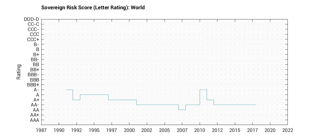
So, we are currently clearly closer to AAA than D. This is a far cry from the increase in global sovereign risk in the aftermath of the Great Financial Crisis and subsequent European debt crisis. We are basically back to pre-crisis levels, so this is progress.
While a global view is a decent starting point, the fact that the chart above takes into account the size of the individual countries also means that you are basically looking at the United States (25%), European Union (21%), China (15%) and Japan (6.5%).
In a few words, the world is not falling apart.
Developed versus Emerging Markets
But let’s break the world down into smaller pieces, first by splitting it into two groups: developed and emerging markets. Here, one can clearly see how emerging markets have improved since the Asian financial crisis in 1997. The decline in sovereign risks justified lower risk premia and also meant that emerging markets as a whole were in good shape before the great financial crisis hit in 2008. By contrast, developed markets were the epicentre of the crisis, recovery was gradual and the average sovereign ratings have yet to return to around the same levels as before.
Since 2016, though, or around the same time as the first rate hike in the US, the average rating of emerging markets as a whole has begun to reverse.
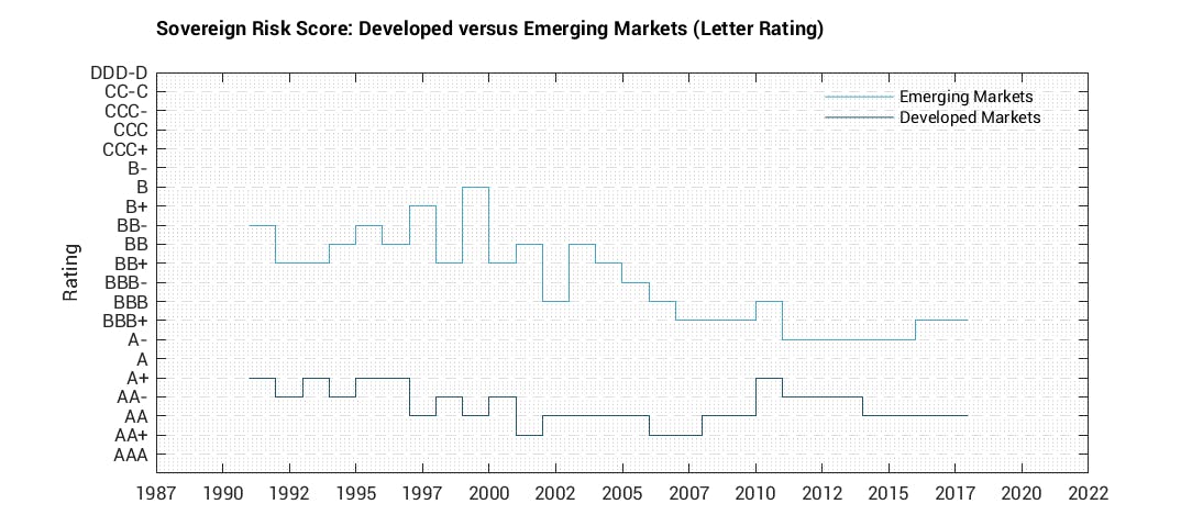
Yes, the negative news flow on several high profile emerging markets is also confirmed in economic data.
Regions: Diverging fates
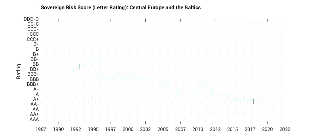
Well that’s the average, so let’s look at each region starting with those that show the best dynamics. Central Europe and the Baltics can be described as a long-term success story of economic convergence. As many may recall, several countries did experience some fallout during the crisis brought on by heavy borrowing from Western banks, mostly in foreign currency. Many have been out of the woods since and from a sovereign risk perspective, several Eastern European countries have stronger fundamentals today than Western European counterparts.
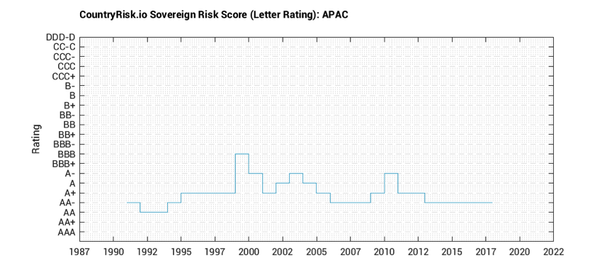
Also on solid-footing is Asia and the Pacific, which show limited warning lights. Political noise aside (Malaysia, Indonesia, the Philippines), the region’s fundamentals look strong. Ditto for China, despite its slowing growth and the over-leveraged Chinese state-owned enterprises. Clearly, though, China merits close monitoring.
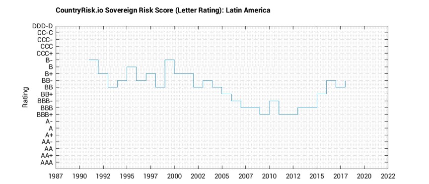
Now, to the “not so good” regions. Latin America is a disappointing story, as some countries that witnessed economic and financial improvements between 2000 and 2010 failed to capitalize on these by not fully fixing problem areas (fiscal, institutions, governance, etc.). Think Brazil, for example. Sure, part of its dividend gains came from the favourable global backdrop during that period, with commodity prices rising to spherical levels. But we also have to acknowledge the steps undertaken in economic policies, which added favourably to investor perception of Brazil then. Sadly the opportunity to mend its fiscal vulnerabilities with more resolve was missed, and these are now creeping up, compounding the risks arising from domestic politics.
Sub-Saharan Africa is another region with negative developments. Similar to Latin America, many African countries profited from higher commodity prices but this push did not lead to long-lasting improvements in institutions, economic structure and government finances.
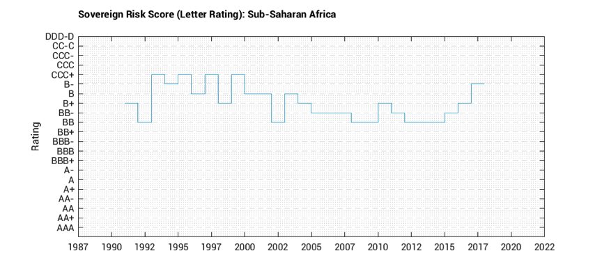
Corruption remains deeply entrenched and rent-seeking in both public office and private sector is still rampant, both of which erode the credibility of progress undertaken.
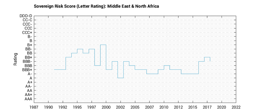
Finally, the average ratings for Middle East & North Africa (MENA) region show the sharpest deterioration between 2015/2016, and can best be explained by deteriorating external balances and increased public debt obligations. It is worth pointing out that there was incremental improvement in ratings, currently at BBB- from BB+. That oil prices remain well-below their peak levels, and geopolitical noise contribute negatively to policy-making and sentiment, we don’t think we’ll see steady improvements in average rating, or by corollary, a decline in sovereign risks in the short-term.
Thoughts
What does this all add up to? We’ve seen a version of this movie before where there are bright spots amid rising global and political challenges. All is not doomed. Whereas the emerging market economies by and large held their own when the US and several European economies entered into a crisis over a decade ago, the latter have started to recover while countries in Latin America and Africa are weakening. Asia is a pillar of strength and Eastern Europe is holding up. Geopolitics and low oil prices at still well below previous peak levels undermine growth fundamentals in the Middle East, not to mention the long-standing economic models that each has lived by. Similarly, Africa’s and Latin America’s fundamentals have weakened significantly and are especially exposed to a deterioration of the global economy and financing conditions.
This is our thesis in a nutshell — other things being equal. But things are unlikely to stay equal, so what could be the sources of complications? First, interest rate increases in the US, the UK and Eurozone is one. Monetary tightening does not come as a surprise and markets seem to be well prepared for it. Nevertheless, countries with weak external positions are likely to feel the pressure. Second, a sharp rise in the USD will not play well with countries with high public debt burdens. Third, protectionist tendencies by the US and the ensuing backlash by its trading counterparts create uncertainties for investors and even more so for corporate planning. Fourth, geopolitical risks are present and real. And the wildcard: there is latent risk stemming from world oil prices.
… But on the other hand, upside risks cannot be discounted. We’ll follow up with a note to highlight the most vulnerable countries but we’ll also underscore those that are looking steadfast. If you want to investigate the sovereign rating for a specific country(ies) yourself, please do so. Register for your free account here. We would love to hear from you.
Written by Bernhard Obenhuber and Jenny Asuncion, co-founders of CountryRisk.io.
All charts produced by the authors with underlying data from World Bank, IMF, United Nations.
